Anabel Toribio


teatro de artes de juan seguin
case study
Teatro De Artes Cultural Arts Center is a non-profit organization that needs to restructure their website to allow for better informed members looking to attend events and register for classes.
Problem Overview

The PROBLEM: We believe providing a more effectively structured website that reflects the priorities of the Teatro De Artes Cultural Arts Center will allow for better informed members looking to attend events and register for classes. Redesigning the website will promote a better understanding of Latino cultural arts and provide opportunities for individuals to develop their artistic talents.
THE SOLUTION: By effectively restructuring the organization of the homepage, the redesign will aid in promoting Teatro’s values of cultural education and provide opportunities for individuals to develop their artistic talents.
My ROLE: Proto-Persona, Research Plan, Hueristic Analysis, Survey, Color Accessibility Test, Affinity Map, Brand Voice Analysis Identity, Brand Positioning Statement, User Persona, User Insight, Problem Statement, Feature Prioritization, Value Proposition, 5-second Usability Test, Prioritization Matrix, Low Fidelity Prototype & Mid-Fidelity Prototype
The Team
3 Team members
Tools
Figma, miro, invision, Photoshop
Research Plan
Research
Definition and
Ideation
Testing and
Iteration
Prototyping
Proto-Persona
Stakeholder Interview
Survey
Hueristic Analysis
User Persona
Affinity Diagram
Brand Voice Analysis Idenity
Brand Positioning Statement
I Like/I Wish
Feature Prioritization Matrix
Affinity Diagram
Value Proposition
Empathy Map
Storyboard
Site Map
5 - Second Usability Test
2nd Color Asessment.
Low Fidelity Prototype
Mid-Fidelity Prototype
Hi-Fidelity Prototype
empathize phase
Proto - Persona
My proto-persona is nurse that lives in the Seguin community and has a family of five. She wishes to involve her children in culturally rich programming and has a difficult time finding activities for her family in Seguin.
.png)
Research Plan Goals
Goal 1
As a user researcher, we want to understand Teatro De Artes' missions and goals and learn about the purpose of the organization's website, and collect information to create an accurate description of this organization's target user.
Goal 2
As a user researcher, we want to understand the heuristic issues that users experience on the Teatro de Artes website.
Goal 3
As a user researcher, I want to determine what are the goals and tasks that users have on the website.
define phase
Heuristic Analysis
Organization and logic of navigation was confusing.
1
Problem
No obvious breadcrumbs when navigating
from primary navigation
2
Problem
Organization of information does not makes sense. Issues with information architecture.
3
Problem
Header is visually cluttered. Imbalance of white space
4
Problem
Inconsistent Design. Some templates are a bit off on
the side, and the video section too big.
color accessibility test
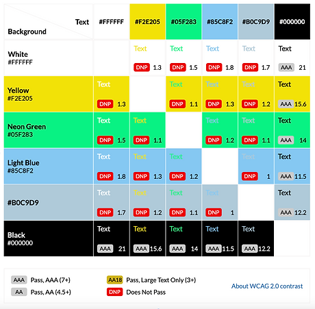
The original color palette for the Teatro website is more pastel and light in value. The only color combinations that received a passing rating is the use of black text on color ground or color on black ground.

empathy map
SAYS
“Teatro is the umbrella, encompassing all cultural arts happenings:
i.e. dance classes, mariachi classes, lectures, Markets.”
THINKS
Family first, community second, granters third.
DOES
Provides resources for financial aid and food insecurity
FEELS
Wants to convey a space space
NEEDS
Parents want to know what kind of community events we put on.
PAINS
Large percentage of users do not like putting their personal information online [registration]
Branding Statement
The Teatro De Artes website we produce helps the Teatro De Artes Cultural Arts Center provide a better understanding of Latino cultural arts and by effectively restructuring the organization of the website and educational content that makes Teatro families and community members feel knowledgeable and valued so they can attend Teatro events and register for classes.
ideate Phase
feature prioritization matrix
After continuing to analyze data, as a team, we created our 2 x 2 prioritization matrix to decide what features to best focus on for our redesign. Our high priority features for both the user and for Teatro de Artes are: FAQ page, an Events Carousel on the homepage, a Redesigned Header and footer, a Help Desk, an Calendar of Events Page, a search bar, and more contrast in the color palette.
2nd Feature Prioritization Matrix after testing

storyboard:

teatro de artes style tile
As we developed the style tile, we agreed as a group to gravitate towards a color palette that conveyes a sense of earthiness, warmth and reliability for the brand.
We discussed on a less saturated color palette to not compete with the vivid images taken from the events and performances documented at Teatro. We wanted to keep buttons and hover states more neutral to also not complete with the images and videos highlighted in the home page carousel or throughout the website.

prototyping phase
site map:
After I completed the card sort, our team created a site map that reflects the needs of users to effectively find information on both the primary navigation, header and footer on the Teatro de Artes homepage. The primary navigation is divided into five pages: About Teatro, Programs, Calendar of events, a photo and video gallery, and sponsorship pages. Our Header contains a search bar and help desk, which where not available in original web design. Our footer, not pictured, contains, communities resource links, contact information, FAQ page, and social media links.

Lo-Fidelity Design Decisions
-
Desktop Lo-Fi wireframe was done on the 12 Column grid with margin 40px gutter of 30px
-
Mobile Lo-Fi wireframe was done on the 4 column grid with gutter of 10px.
-
We decided to move the sponsor section above the footer area promote Teatre De Artes for users mainly.
-
Better balance was established between the white space and space that is used on the homepage for both mobile and desktop.


testing phase
Mid-Fidelity Design Decisions
-
After our interview with the board, it was communicated that they did not want a website that looked “corporate”
-
Our first round of testing pointed out the issue in navigation where the users didn’t know where to go when asked to find upcoming event "Noche De Gala."
-
We resolved this issue by adding the,"Noche De Gala," as another item in secondary navigation.
-
We also added Community Resources in the footer as requested by the board.


5-second usability testing
Desktop:
-
Transparency is clear about what the organization is and does.
-
Was unable to look at videos from a glance, didn’t feel the need to scroll through videos to find specific video.
-
“The nonprofit cultural arts organization thing is a little underwhelming for what the stamps are”
Mobile:
-
Looked comfortable, easy to read, easy to find things.
-
“..quickly you can get to the entire thing and everything you could possibly need if you wanted to contact them. Easily accessible. very open about donations. Easy to access with different easily to find like things like directions are very easily presented.”
-
“I wonder if the Teatro De Artes Logo is the logo or is it a metal or award?”
Overall feeling and look of homepage was warm and comfortable
Reflections

As a group we concluded that every page needs to be translated to Spanish for the Latino community.
For future development, we would like to add a feature to allow users to register for classes online as well as develop an onboarding process for Teatro students to have personal profiles on the website.